Showing posts with label colour. Show all posts

Saturday, 12 December 2015

Blueberry Park Fabric

It has been a long time since I last bought quilting fabric.

My tiny sewing fund has been limited to materials for my City and Guilds.

That all changed when I found out the lovely Karen Lewis of Blueberrry Park had her first fabric line coming out. It started a bit of an obsessive searching to find the prints and the things that people have been sewing with it!


I have a few scrap pieces of Karen's screen printed fabric which I am treasuring until I have the perfect plan for them, so I knew I HAD to have the collection of fabric.... but how to afford it?

Having just a few fat quarters wasn't going to cut it, I NEED to have the whole collection...

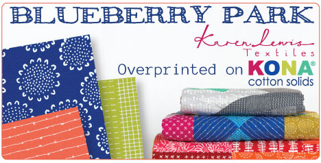
That's when the amazing UK shop that is Simply Solids came to the rescue. They have a wonderful monthly Blueberry Park club. Seven fabrics from the collection each month, over ten months. So I can get the whole range and spread the payments - what's not to love?!?!?

This week the first bundle from Simply Solids arrived and I am in love! Seriously in love!


The first seven are from the selection above and they are gorgeous!

I have a plan for them already. I missed a very dear friends 40th birthday last year. I had planned to give her a quilt, but I just didn't manage it. I want to design and make a medallion quilt for her and these fabrics are just perfect. Maybe I didn't manage it last year because I knew Karen was going to bring me inspiration with her fabulous fabric line!

Saturday, 17 May 2014

Half Square Triangle - HST

At the moment I am teaching 3 beginners patchwork classes in one day - I do like a challenge!

I teach all my beginners how to make half square triangles (HST). They are the most versatile building block in patchwork and lead easily to lots of different designs.

I thought I would collate some fabulous quilts made using HST as their base unit as inspiration for all those new to HST!

From Red Pepper Quilts
Love the mix of solid colour and bright patterns!

From Sew Katie Did
This quilt is a wonderful mix of HST in solid colour, no plan just go for it!

From The Cottage Mama

Love the mix of colour and the geometric shape.

From Quilt Addict
These stars are so lovely!

From Freshly Pieced
This scrappy HST quilt is divine!

Hope you find this gorgeous collection of quilts just as inspiring as I do!


Friday, 16 May 2014

An Afternoon of Colour!

I am lucky enough to live in area rich in textiles heritage.

Stroud is 10 miles away and has a wonderful International Textiles Festival every May.

They have exhibitions, talks and 2 Open Studio weekends!

Last Saturday I was able to get a ticket to a talk by my favourite fabric dyer, Ruth Issett.


Her work is inspirational and so bright!


I have managed to buy all her books over the last few months and I use her book Colour on Cloth whenever I am dyeing fabric. It is full of dye recipes, methods and inspiration!


During her talk she explained some of her processes and her inspiration. She is very passionate about colour and exploring it's uses. I really enjoyed the talk and learning how an experienced textile artist works.

I love being able to explore how other artists work. Midi and I are off the on textile trail together on Sunday. We have a list of artist we want to visit and places to stop off for yummy cake... it is going to be so much fun!!!


Monday, 21 April 2014

City and Guilds Module 3

Last term was filled with teaching classes and working on Module 3: Colour and Applique.

I love colour and have 3/4 books by my bed all about the chemistry of colour, the meaning of colour and the development of synthetic pigments.


As usual I had to investigate colour, which was fun! Then I had to choose an artist to research. In February I visited a exhibition about Henri Matisse's paper cuts at Strouds Museum in the Park.


His paper cuts were completed when he was too ill to paint and sculpt, but the need to create art remained. With the help of an assistant he used paper to create huge murals, that were colourful and vibrant:

La Gerbe, Henri Matisse (1953)
I love the mix of colours and the scale of the original pieces is huge!

As well as exploring colour I had to develop the portfolio using a historical theme. I visited Bath and took lots of photos of the gorgeous Georgian buildings and the Fashion Museum. The course notes suggested developing a design around a piece of historical textiles. I chose an 18th Century embroidered ribbon:


From this I explored colouring pencils, felt tip pens and paint!


It was great fun playing around with colouring pencils and pens! Lovely to have the freedom to just play!

The applique element was developed in making my samples for the module:

Needle Turn Applique

Reverse applique

Machine applique with painted paper, plastic, Roses wrapper and hand dyed fabric/felt

Machine reverse applique using felt
The loved completing the applique and I was lucky enough to use Oakshott fabrics. The bundle I used is called Lipari and is simply gorgeous! The best bit is I have loads left to make another quilt!

My final piece was developed from the first portfolio - Line:


I experimented with hand dyeing different weights of fabric, threads, bubble wrap and postcards. It was great fun and I really love the final piece.

Next it's Texture and Landscapes/Geological.... and it has to be done in black and white! So exciting!

Tuesday, 18 February 2014

Colour: Yellow

The last primary colour is yellow..... sunshine!

In the UK at the moment the sun has been missing in rain for a very long time... we had a glimpse of it on Sunday.... but now we are back in a world of rain clouds and water....

So to cheer everyone up lets look at yellow as a colour!


Yellow is the colour of butter, bananas, gold and sunshine!

It is a colour that always makes me smile.


Like red and blue, there are lots of shades of yellow:


As a colour it represents reason, optimism, pleasure and happiness - you only have to think how to feel on a sunny day.On a sunny day the whole world feels like a much better place!

But it also has negative connections too. It is associated with cowardice, envy, jealousy and betrayal. Yellow as the colour of cowardice since the 19th century, but the exact reason it is associated with cowardice is not known.


In China it has major significance as it is the colour of happiness, glory and wisdom. It is a masculine colour.


Saturday, 8 February 2014

Colour: Blue

Blue is next on the list for exploration.

Blue is a beautiful colour, full of harmony and has the wonderful effect of calming people - just think of staring out at a bright blue sky.


Blue is the colour of the ocean and the sky, it is full of depth. There are so many blues in the world, each one conveys a different feeling to the viewer.


Indigo has a long history as a dye and is the colour of blueberries and blue jeans! The first demonstration of peaceful disobedience led by Mahatma Gandhi in 1917 was in support of the indigo farmers. The process of extracting the pigment from the Indigo plant is lengthy and leaves the worker with indigo coloured hands!

Ultramarine is a vivid, deep blue that was widely used in paintings to produce the intense blues we still see today. The process to get the pigment from lapis lazuli is so complex that Ultramarine was more expensive than gold!


One of my favourite paintings, Girl in the Pearl Earring by Vermeer in 1665, uses Ultramarine mixed with lead white to create the blue in the head scarf. It is an amazing blue!

Another one of my favourite blues in Cerulean Blue, which is a synthetic blue developed in 1812. It is the paint used by Claude Monet in his paintings and give his paintings an amazing grey/blue. When I was teenager my mum and I spent a wonderful 4 days in Paris exploring the Musee D'Orsay. We spent a wonderful afternoon gazing at Monet's paintings.

The Gare Saint-Lazare, 1877
There are so many different blue's to explore, from the ones derived nature to synthetic pigments. Each one is calming and has an interesting story to tell....


Saturday, 1 February 2014

Colour: Red

Module 3 of the City and Guilds is all about Colour.

I love colour and I am fascinated by the development of the colours we now take for granted today. How did the colour lilac develop? Where does Cerulean Blue come from?

So I thought I would start a series investigating colour, working from the 3 primary colours of red, yellow and blue, then looking at secondary and tertiary colours...

It will help me build colour ideas and palettes for my design work, a kind of online mood board...

So starting with red...


Red is the colour of blood, strawberries and ladybirds. It is a sign of danger - think of stop signs - all over the world. It is vibrant and represents passion, desire and energy.


When you think of the first world war it the red poppies that spring to mind and rivers of bed blood that flowed through France.


In Eastern cultures it represents happiness. My youngest came home from school yesterday with a red Chinese packet with sweets for the Chinese New Year. The red envelope symbolizes good luck and is to ward off evil.


Red is my favourite colour and used to be my mums. When she passed away she had a red coffin and everyone had to wear red to the funeral... that would have made her smile!


Gotta love a pair of red shoes!


Tuesday, 31 December 2013

Lost my Crafty Voice!

It has been so long since I last wrote anything that I feel slightly embarrassed!

It has been a long 7 weeks with many ups and downs to the point that I lost my crafting voice... it actually wandered off for a long walk without me!

A combination of a manic teaching schedule, 2 Scout groups, a family illness and an 11yo struggling to settle into secondary school left with only just enough energy to crawl into bed and sleep. When you have kids you think that first year is the toughest - I now know that it gets harder as they get older, so much so that it makes the first year feel like bliss!!!!

I have missed my voice here and I am hoping it will come back to full force soon - still not quite there...

Have you ever reached that point?

Any tips for getting it back?

I have also been working my way through module 2 of the City and Guilds. It is all about shape. I have been exploring dyes, drawing and working with paints! So much fun!

Here are some examples of my dyeing journey so far:


It is great fun mixing the colours and experimenting with different fabrics. Above is Linen/cotton mix, viscose wool felt and cotton organdie. They absorb the fabric at different rats so come out slightly differently.


Here I added black to some of the fabrics from the dye chart above.


These are my favourite so far. My dye recipe book is filling up fast with samples, colour washes and recipe details!

All of this is part of my skill development for my course. I have managed to get 4 samples done so far this week for the module. One more complex sample to do and then my finally experimentation piece...


Cable stitch on hand dyed cotton lawn.


Whip and feather stitch on calico with straight stitch embroider as the border.


Couching stitch with ribbon, embroidery threads and perle cotton no 8 on viscose wool felt painted with fabric dye.

It is an amazing journey to be on!

Have an amazing New Years Eve wherever you are and I  hope to see you in 2014 for more sewing/quilting adventures!